Facebook’s account deletion process is a master class in bad UX. Fastcodesign, I deleted my Facebook account this weekend. For years I’d had this nagging feeling that the company was trying to hijack my life story, so I had already deactivated it about three years ago. But as the Cambridge Analytica details emerged last week and calls to #deletefacebook spread across the web, I knew that it was time.
Unsurprisingly, Facebook made deleting my account difficult and unpleasant. This inconsiderate UX only confirmed that the dark patterns in Facebook’s business model run deep, and those patterns are part of a culture that enables manipulative design and lack of transparency.
Here’s how it went down:
- NO CLEAR NAVIGATION TO DELETE YOUR ACCOUNT
There are a plethora of third-party “how-to” articles about deleting your Facebook account because, for a company that employs hundreds of UX designers and researchers, it’s not a very intuitive process. For starters, you have to understand that deleting your account is different from deactivating it—and those two options are nowhere near each other on the site. You can find the option to deactivate in your settings, but Facebook has no such menu item for deleting your account. You can search “Delete my account” in the Help Center, and the answer has a link to the page you need. Strangely, though, Facebook puts that hyperlink at the end of a long paragraph, in the phrase “let us know.” A better option? A “Delete My Account” button at the top of the page.
- IGNORING THE USER’S INTENT
I finally got to the deletion page. From there, the next few steps I had to take should have been fairly straightforward. Instead, I stumbled through a series of poorly organized steps.
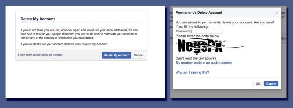
After clicking “Delete My Account,” a verification window with a CAPTCHA popped up. I first hit “Cancel” by accident—and very nearly did it a second time—because the color scheme for the buttons had been switched: “Cancel” was in blue this time, whereas I had been accustomed to using blue buttons to confirm actions on Facebook. This isn’t unheard of in UX design—often, when the user’s primary action is negative (in this case, deleting something), designers will call visual attention to the secondary action, as a safeguard against a potentially destructive or irreversible action.

But I had to very intentionally seek out the deletion page. I had to press the big blue “Delete My Account” button with purpose. I had to go through a verification and type in a CAPTCHA with steely determination (more on that in a second). I was hardly there by accident, so switching the colors wasn’t in my best interest. Accidentally deleting my account was an unimaginable scenario when I had already put in a good deal of work to get to this point.
- ABYSMAL INFORMATION HIERARCHY
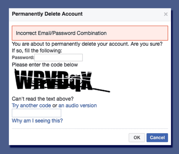
Much to my dismay, I misread the directions in the CAPTCHA window about six or seven times, receiving this error message:

User error played a part here. Since I’d done this sort of verification for many other websites in the past, I truthfully hadn’t read the copy very closely (a natural human tendency that UX designers should design for). I figured the CAPTCHA went in the top text box, and I would only use the bottom text box if I couldn’t read the supplied code. Wrong. It wanted my Facebook password first, then the CAPTCHA code at the bottom. Visually speaking, this window was a mess. The hierarchy was confusing and all over the place.
Information architect and usability expert Steve Krug says in his bookDon’t Make Me Think that one of the most important things to know about how people use websites is that they don’t read, they scan. And, according to an eye-tracking study done by Jakob Nielson in 2008, less than 20% of text content is actually read on an average web page. So while the instructions work if you read them line by line, no one does that, and Facebook surely knows it. The design should stand on its own.
- EMOTIONAL MANIPULATION
If the Cambridge Analytica scandal has had any positive impact, it has given us a concrete framework to talk more broadly about Facebook’s questionable design practices.
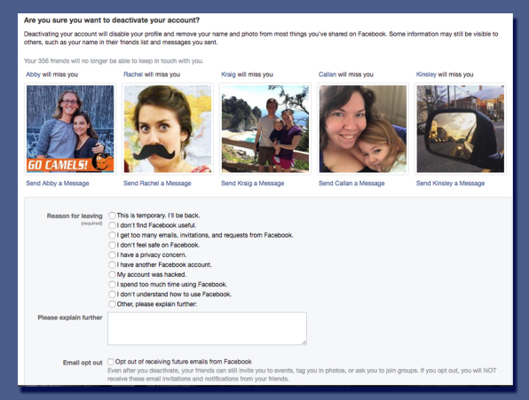
While I was frustrated by the terrible UX of Facebook’s deletion process, I wasn’t surprised by it. It only speaks to the larger tendency the company has to employ manipulative UX. For example, when I deactivated my account several years ago, Facebook went to great lengths to talk me into staying, showing me my friends’ faces, and telling me they’d miss me. Or this weekend—Facebook manufactured 59 notifications for me out of thin air once I got to the deletion page, when just minutes earlier I’d had none. And, as we now know, Facebook’s UX makes it all too easy to unknowingly surrender personal information to third parties because of how apps are designed to function within Facebook.

Facebook will have to make some big changes in the upcoming months to win back users’ trust; revisiting some of these disingenuous UX practices would be a good place to start. Would a straightforward deletion process keep me on Facebook? Doubtful. But a broader overhaul might. Until then,I join the masses in saying “good riddance.”


